Composable
Pages are YAML lists of typed blocks.
Each section below is one block type: what it's for, the schema-backed YAML you write, and a live preview when a meaningful standalone preview is possible. The test suite validates every example.
section-headerStandalone section header with rich text intro.
blocks:
  - type: section-header
    intro: >-
      ## Section headers introduce a page section


      Use one wherever a group of blocks needs a heading and a sentence of
context.Use one wherever a group of blocks needs a heading and a sentence of context.
featuresGrid of feature cards with optional icons, names, and descriptions.
blocks:
  - type: features
    intro_content: "## A grid of features"
    items:
      - icon: hugeicons:cube
        name: Composable
        description: Pages are YAML lists of typed blocks.
      - icon: hugeicons:shield-01
        name: Validated
        description: Unknown types or keys fail the build loudly.
      - icon: hugeicons:rocket
        name: Static
description: Everything renders to plain HTML at build time.Pages are YAML lists of typed blocks.
Unknown types or keys fail the build loudly.
Everything renders to plain HTML at build time.
image-cardsGrid of cards featuring images with names and optional descriptions.
blocks:
  - type: image-cards
    items:
      - image: breakfast.jpg
        name: Breakfast
        description: Cards pair an image with a name and description.
        link: /news/
      - image: lunch.jpg
        name: Lunch
        description: Images get responsive srcset and LQIP placeholders.
      - image: dinner.jpg
        name: Dinner
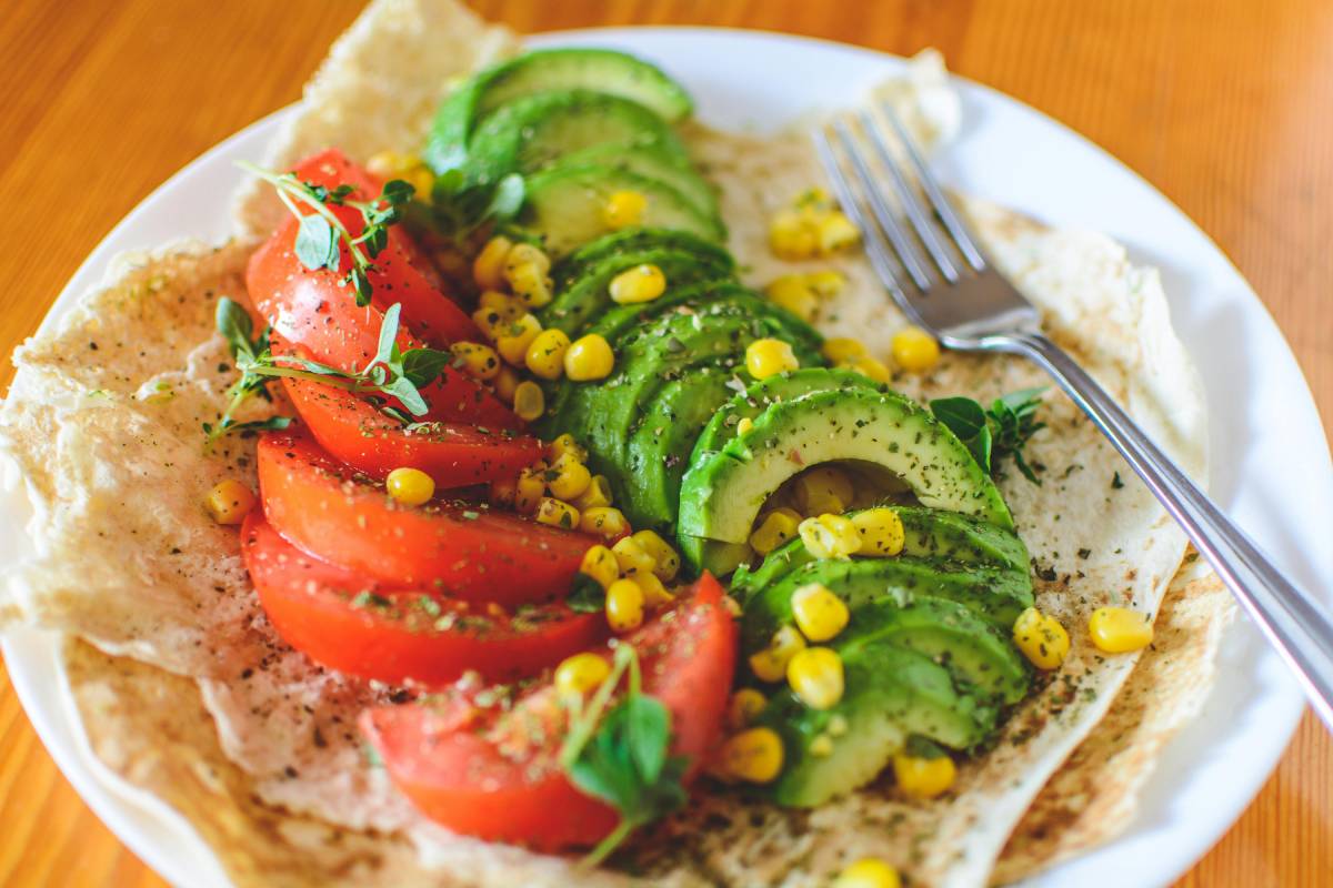
description: An optional link makes the whole card clickable.Cards pair an image with a name and description.
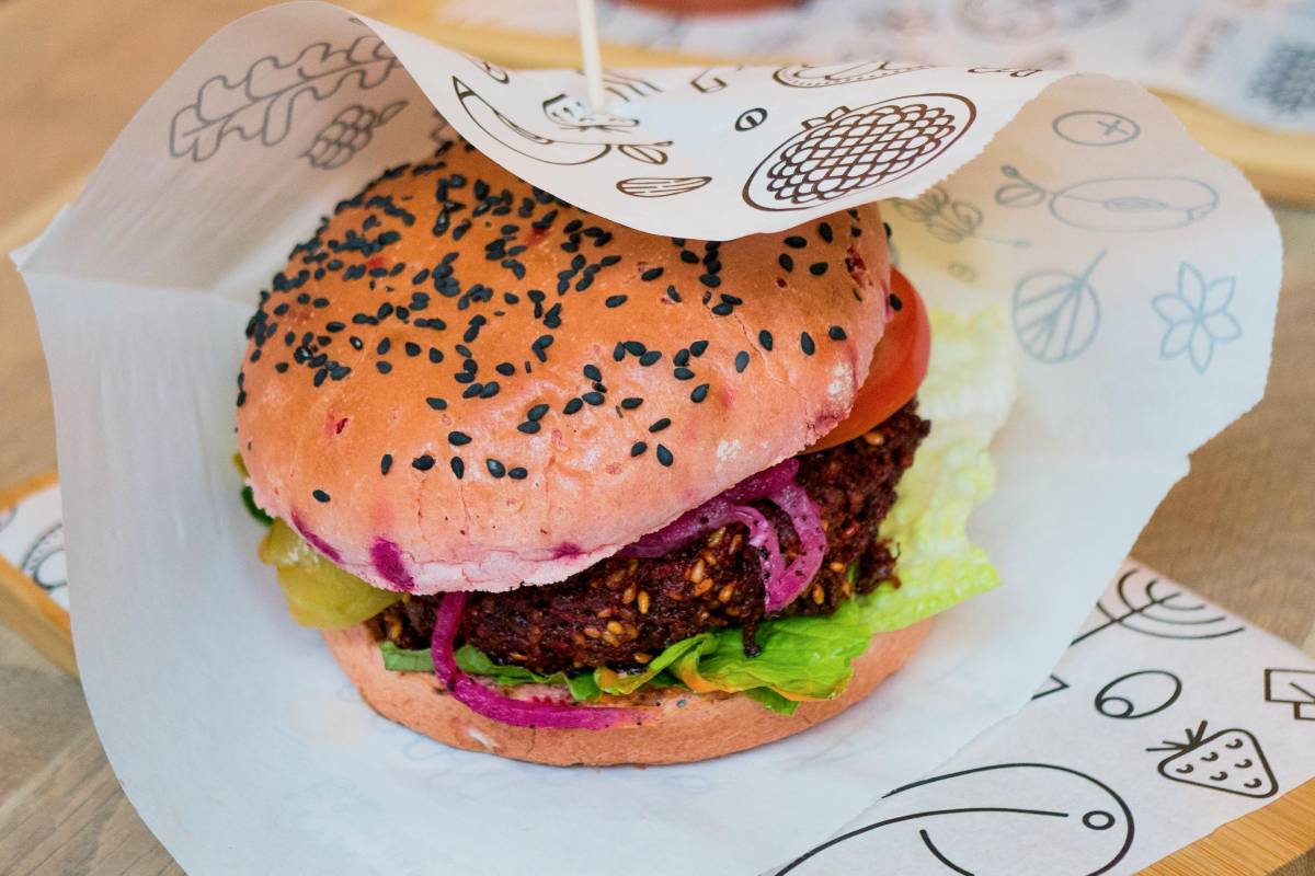
Images get responsive srcset and LQIP placeholders.
An optional link makes the whole card clickable.
statsKey metrics displayed as large numbers with labels.
blocks:
  - type: stats
    items:
      - value: 35+
        label: Block types
      - value: 100%
        label: Line coverage
      - value: "0"
label: Servers to runcode-blockTerminal-style code display with macOS-like toolbar header.
blocks:
  - type: code-block
    filename: quick-start.sh
    language: bash
    code: |-
      npm install
npm run servenpm install
npm run serveheroFull-width hero banner with optional badge, markdown content, and action buttons.
blocks:
  - type: hero
    badge: Hero block
    content: >-
      # A full-width opening banner


      Start most pages with one of these: a heading, a sentence of context, and
      the actions that matter.
    buttons:
      - text: Primary action
        href: /guide/
        variant: primary
        size: lg
      - text: Secondary
        href: /news/
        variant: secondary
size: lgStart most pages with one of these: a heading, a sentence of context, and the actions that matter.
split-imageTwo-column layout with text content and a responsive image.
blocks:
  - type: split-image
    subtitle: Split layouts
    content: >-
      ## Text beside an image


      The figure sits on the right by default; set `reverse: true` to flip the
      columns.
    figure_src: fireworks.jpg
    figure_alt: Fireworks over a city at night
    figure_caption: Captions are optional.
Split layouts
The figure sits on the right by default; set reverse: true to flip the columns.

split-codeTwo-column layout with text content and a code block.
blocks:
  - type: split-code
    subtitle: Split layouts
    content: >-
      ## Text beside a code block


      Use this to walk through configuration or commands next to the
      explanation.
    figure_filename: site.json
    figure_language: json
    figure_code: |-
      {
        "name": "My Site",
        "url": "https://example.com"
      }
Split layouts
Use this to walk through configuration or commands next to the explanation.
{
  "name": "My Site",
  "url": "https://example.com"
}split-icon-linksTwo-column layout with text content and an icon-links list.
blocks:
  - type: split-icon-links
    subtitle: Split layouts
    content: |-
      ## Text beside a list of links

      Each link gets an icon.
    figure_items:
      - icon: hugeicons:book-02
        text: Guides
        url: /guide/
      - icon: hugeicons:news
        text: News
        url: /news/
      - icon: hugeicons:search-01
        text: Search
url: /search/split-htmlTwo-column layout with text content and custom HTML.
blocks:
- type: split-html
subtitle: Split layouts
content: |-
## Text beside custom HTML
The figure column renders whatever HTML you give it.
figure_html:
Split layouts
The figure column renders whatever HTML you give it.
split-calloutTwo-column layout with text content and a styled callout box with icon, name, and subtitle.
blocks:
  - type: split-callout
    subtitle: Split layouts
    content: |-
      ## Text beside a callout card

      Good for highlighting one key fact or contact route.
    figure_icon: hugeicons:call
    figure_name: Talk to a person
    figure_subtitle: Phone lines open 9-5, Monday to Friday.
Split layouts
Good for highlighting one key fact or contact route.
Phone lines open 9-5, Monday to Friday.
split-fullFull-width two-panel layout with distinct background colors per side.
blocks:
  - type: split-full
    variant: dark-left
    left_content: |-
      ## Two panels

      Each side takes its own content and button.
    left_button:
      text: Left action
      href: /guide/
      variant: secondary
    right_content: |-
      ## Side by side

      Variants control which side is dark.
    right_button:
      text: Right action
href: /news/Each side takes its own content and button.
Variants control which side is dark.
ctaCall-to-action banner with gradient background.
blocks:
  - type: cta
    content: |-
      ## Ready to try it?

      A call-to-action closes the page with one clear next step.
    button:
      text: Read the guides
      href: /guide/
size: lgcalloutOne-column callout/note with icon, name, and short content — for content warnings, advisories, tips, etc.
blocks:
  - type: callout
    variant: info
    icon: hugeicons:information-circle
    name: Good to know
    content: Callouts hold short advisories, tips, and warnings. Four color variants
are available.image-backgroundFull-width image background with hero-style overlay content (badge, markdown content, buttons) and optional parallax.
blocks:
  - type: image-background
    image: city-traffic-night.jpg
    image_alt: City traffic at night
    tint: true
    badge: Image background
    content: |-
      # Content over a full-width image

      A tint keeps the text readable.
A tint keeps the text readable.
itemsDisplays an Eleventy collection as a card grid or horizontal slider.
blocks:
  - type: items
    collection: news
    intro_content: |-
      ## A collection as cards

This example renders the `news` collection.This example renders the news collection.
items-arrayRenders items from an explicit list of paths. The collection is inferred dynamically from each item's path. Directory paths (ending in / or with no .md extension) expand to every item in that directory.
blocks:
  - type: items-array
    items:
      - news
    intro_content: |-
      ## Hand-picked items

List file paths, or a directory to include everything in it.List file paths, or a directory to include everything in it.
items-text-listRenders a collection as a comma-separated inline list of links, with optional introductory markdown text prepended. Excludes the current page from the list.
blocks:
  - type: items-text-list
    collection: news
    intro_content: "Read our latest news posts:"
Read our latest news posts:
link-columnsRenders a collection as a plain-text unordered list of links arranged in responsive CSS columns. Optionally strips matching text via a regex so repetitive prefixes/suffixes can be removed.
blocks:
  - type: link-columns
    collection: news
intro_content: "## A collection as link columns"markdownRenders markdown content as rich text.
blocks:
  - type: markdown
    content: >-
      ## Plain markdown


      The simplest block: write markdown, get rich text. Lists, links, and
      **emphasis** all work.


      - One

      - Two

- ThreeThe simplest block: write markdown, get rich text. Lists, links, and emphasis all work.
table-of-contentsIn-page contents built from the headings the page actually renders.
blocks:
  - type: table-of-contents
    title: On this page
levels: 2,3htmlOutputs raw HTML without processing.
blocks:
  - type: html
    content: Raw HTML passes straight through - the escape hatch
      for one-off markup.
Raw HTML passes straight through - the escape hatch for one-off markup.
iframe-embedThird-party iframe embed (itch.io widgets, Buttondown, Bandcamp, Stripe buttons, etc).
blocks:
  - type: iframe-embed
    src: /news/
    name: The news page, embedded
    aspect_ratio: 16/9
max_width: 560pxincludeIncludes an arbitrary template file.
blocks:
  - type: include
    file: demo-include.html
This paragraph comes from src/_includes/demo-include.html,
pulled in by an include block - the escape hatch for content
the block system doesn't cover.
news-metaRenders a news post's metadata: author name plus the post date.
blocks:
- type: news-metafaqsRenders question/answer pairs as a definition list. Available on all page types.
blocks:
  - type: faqs
    intro_content: "## Frequently asked questions"
    items:
      - question: How are FAQ answers formatted?
        answer: Answers support **markdown**, including links and lists.
      - question: Where else can FAQs come from?
answer: Omit `items` and the block falls back to the page-level `faqs` array.Answers support markdown, including links and lists.
Omit items and the block falls back to the page-level faqs array.
guide-categoriesDisplays the site-wide guide categories.
blocks:
- type: guide-categoriesDeep dives into complex features and customisation
Learn the basics and get up and running quickly
guide-headerRenders a guide page's heading: title and optional subtitle.
blocks:
- type: guide-headerguide-navigationRenders a 'Back to
blocks:
- type: guide-navigationguide-pages-listLists the guide pages that belong to the current guide category (filtered via guidesByCategory).
blocks:
- type: guide-pages-listlink-buttonStandalone centered button linking to an anchor or URL.
blocks:
  - type: link-button
    text: A standalone button
    href: /search/
variant: primarygalleryImage grid with optional aspect ratio cropping and captions.
blocks:
  - type: gallery
    intro_content: "## An image grid"
    aspect_ratio: 4/3
    items:
      - image: breakfast.jpg
        caption: Breakfast
      - image: lunch.jpg
        caption: Lunch
      - image: dinner.jpg
        caption: Dinner
      - image: fireworks.jpg
        caption: Fireworks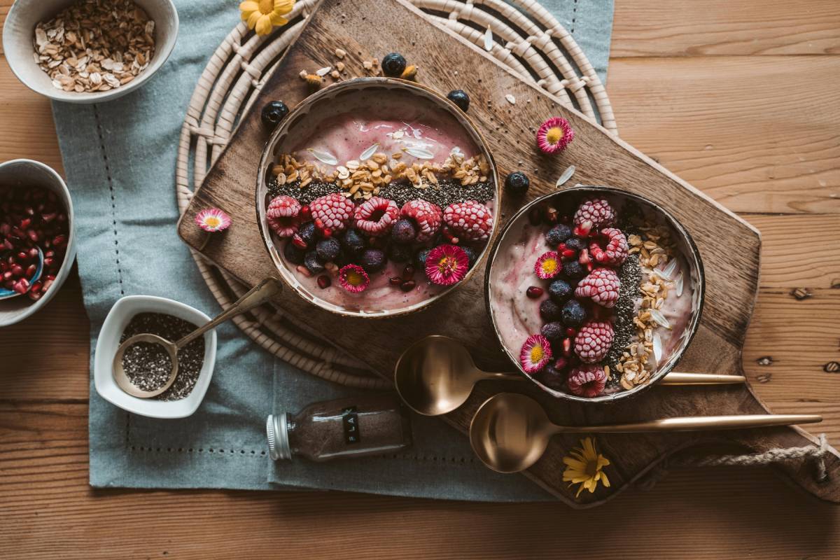
Breakfast
Lunch
Dinner

Fireworks
marquee-imagesContinuously scrolling marquee of images (e.g. brand logos, partner badges).
blocks:
  - type: marquee-images
    height: 60px
    items:
      - image: breakfast.jpg
        alt: Breakfast
      - image: lunch.jpg
        alt: Lunch
      - image: dinner.jpg
        alt: Dinner
      - image: fireworks.jpg
        alt: Fireworks


icon-linksVertical list of links with icons, rendered as a flex column stack.
blocks:
  - type: icon-links
    intro_content: "## Links with icons"
    items:
      - icon: hugeicons:book-02
        text: Read the guides
        url: /guide/
      - icon: hugeicons:news
        text: Latest news
        url: /news/
      - icon: hugeicons:search-01
        text: Search the site
url: /search/downloadsList of downloadable files. Each item auto-detects its icon from the file extension and its size from the filesystem at build time.
blocks:
  - type: downloads
    intro_content: "## Files to download"
    items:
      - file: /files/template-overview.txt
label: Template overview (TXT)snippetRenders blocks from a named snippet file, enabling reusable block compositions.
blocks:
  - type: snippet
    reference: demo